Although most of us
have not had the opportunity and hopefully will never have the opportunity of
directly seeing Satan in person, there are certain familiar images that
immediately come to mind when his name is mentioned. The actual particulars of the
image that come to mind will invariably be different from person to person;
however, there will more or less exist a common thread that links these mosaic images
into a unified tapestry of representation. The fact that there exists such a
common thread is not surprising since much of what we think and believe is a
product of our common cultural upbringing. The existence of this common thread is
fundamentally rooted in what we as a society define evil to be. In general, for
obvious reasons, evil is commonly despised and as such associated with the
sensations of disgust and fear in all their possible permutations. Thus Satan,
who is the ultimate personification of evil, is naturally visualized as
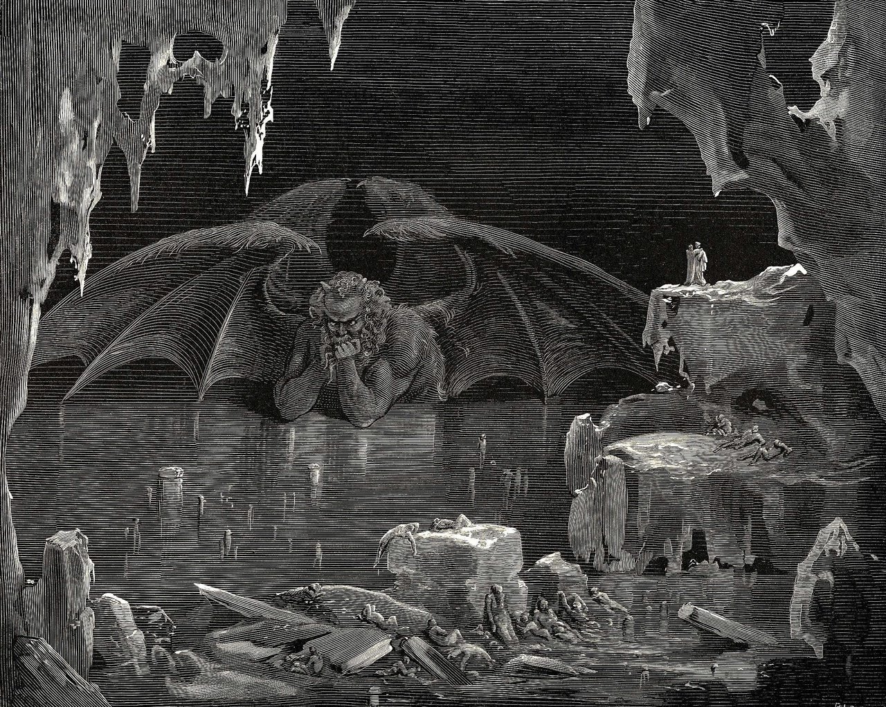
repulsive by most people and Dante as well. It is this image of repulsiveness
that I had in mind when I began searching for artistic renditions Satan. In my
search, I found two artworks that gave two contrasting representations of
Satan. The first of the artworks is Gustave Dores’ depiction of Dante’s version
of Satan and the second is William Blake’s depiction of John Milton’s version
of Satan from his poem Paradise Lost.
As stated before, I expected there to be
differing representations of Satan and so I was not too surprised by the difference
itself between the Dore/Dante and the Blake/Milton artworks. However, I was
surprised by the magnitude of difference that did exist between the two
artworks. In fact, the two artworks differ so much in their representation of
Satan that it is almost as if they are depicting two completely separate
entities. If one deconstructs the artworks, it becomes evident at how each artwork’s
individual components work together to create the difference. For instance, in
terms of color choice, the Blake/Milton artwork makes use of bright and vibrant
colors while the Dore/Dante artwork uses dark and dull colors. This difference
in color choice has the effect of making the Satan in Blake/Milton appear more
attractive and lively, and has the opposite effect of making the Satan in
Dore/Dante appear more unpleasant and depressive. Additionally, the gapping
difference between the two Satan is even further enlarged by their contrasting
physical appearance. In the Dore/Dante artwork, Satan is physically repulsive
with his beastial form and bat-like wings, while in the Blake/Milton artwork he
is physically attractive with his fair appearance and looks like a man.
Moreover, due the great
difference between the Dore/Dante and Blake/Milton representations of Satan, it
seems that the idea of the unified tapestry of representation described earlier
should certainly become undone at the seams. However, it does not become undone
since the discrepancy in the representations does not result from any
fundamental difference. Although I have not properly read Milton’s Paradise
Lost, I think it is reasonable to assume that he was in no way seeking to
advocate the goodness of evil. Rather, I think what he was attempting to do, as
presented by Blake, was to emphasize the complexity of the personified Satan as
a literary character.
Overall, I think the
difference between the two representations help highlight two possible
responses to the concept of Satan. The most
common type of response is the emotive response that relies on the immediate sensations
of disgust and fear that we instinctively associate with the evil of Satan. The
Dore/Dante artwork is closer to this type of response. Another type of response
is the intellective response that is more developed and capable of dealing with
the consequences of evil personified despite the apparent contradictions.

No comments:
Post a Comment